Identity

The Ankler
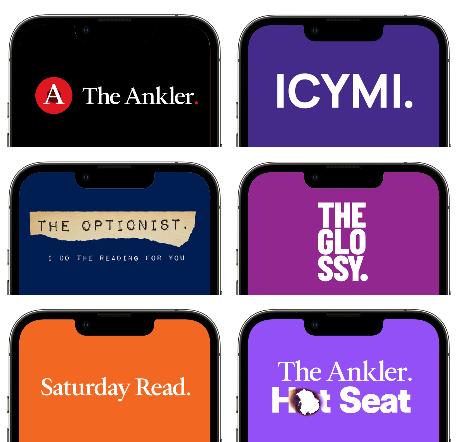
Richard Rushfield, a former entertainment columnist who wrote for BuzzFeed, The Los Angeles Times and Gawker, had created a “Hit Hollywood Newsletter” (New York Times) which he called “the newsletter Hollywood loves to hate and hates to love.” It caught the attention of Janice Min who became partner, helping Richard to expand and refine its brand. Janice asked me to design a new smarter and more sophisticated logo for The Ankler, which turned into something like 12 logos for other newsletters and podcasts under The Ankler media’s umbrella.
Creative Direction and Design: Dawn Camner


Billboard Hot 100 Music Festival
Logo design for the very first Billboard music festival hosted at Jones Beach in New York. The client wanted something that felt 'beachy' but also like the large music festival that it was slated to be. I designed a custom logotype with repeating lines and circles that symbolize sound waves in water; bright, sharp sounds. These poster mockups were inspired by the key art for the 1966 surf documentary "The Endless Summer".



FORT Los Angeles
Partnering with the branding experts at Aubry & Co. agency, we created a primary/social logo
and color palette for FORT LA.
FORT (Friends of Residential Treasures) Los Angeles is a scholarly but inclusive non-profit that celebrates what makes LA’s neighborhoods creative, innovative and unique while facilitating the exploration of LA’s residential history, culture and architecture in a fun, community-oriented and experiential way.
In-depth brand strategy work revealed a mission to express a sense of fun and architectural exploration similar to the concept of a real-life community museum. We wanted the identity to feel fun and inclusive, but also attractive to architecture scholars who would contribute to the FORT programs.
The logomark is inspired by the triangular-shaped themes used throughout the Sheats–Goldstein Residence in Beverly Hills. With the letterforms, they symbolize the structure of a home with an exciting architectural design. The colors are citrus and marine-inspired to feel very SoCal coast.
Strategy: Dawn Camner, Carrie Rosten
Creative Direction and Design: Dawn Camner


TBD Mama
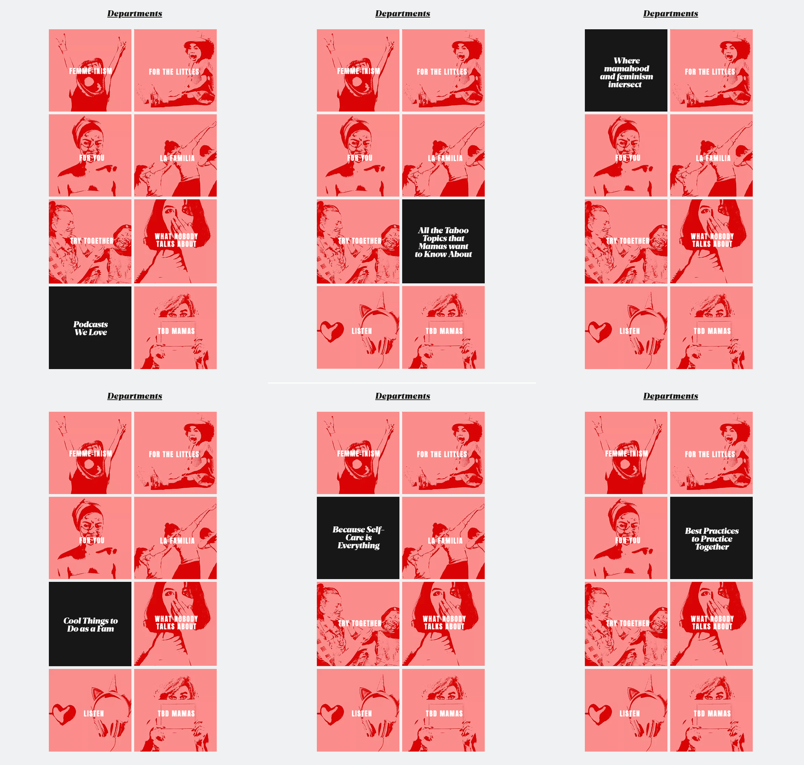
What started as a newsletter for progressive urban moms has grown into a fully editorial site with the same content, just better packaged and more fun to navigate.
I was tasked to, build a brand identity around the existing logo, and to build a website that feels completely different from other mom-focused content online.
The brand should feel a bit irreverent, smart, and open to the messier topics related to being a mom. The site and overall look are inspired by 80's and 90's feminist zines and posters, especially Riot Grrl content.
Strategy: Dawn Camner and Carrie Rosten
Creative Direction and Design: Dawn Camner




The Olympia Collective
The Olympia Collective is a nonprofit strategy consulting firm founded by veteran strategist Olympia Ammon. After conducting brand discovery, we learned that Olympia’s most distinctive descriptors according to colleagues and clients are: Energized, driven, vibrant, brilliant, dynamic, fun, collaborative, etc. She’s a fireball and the most enthusiastic and warm client I’ve ever worked with. Based on descriptors like “vibrant”, “brilliant”, “dynamic” and “fun”, the inspiration for the logo comes from Josef Albers’ color theory exercises on luminosity. I created a logo with an “O” monogram in vibrant, sunny colors in a pattern that emits luminosity. The color palette also includes a sky blue that when used together with the warm colors, subtly denotes the sun in the sky. Our photography style is colorful, graphic, minimal and conceptual. We want the viewer to feel the collective's smartness, happiness, and hard-working ethos through the images. I designed her website and wrote the copy for her landing page. The headline is “Say Hello to Your Happy Nonprofit” which was meant to sound welcoming and friendly. Olympia loved the phrase “Say Hello” and decided to use it as a tagline for her branding. I designed a special auxiliary “Say Hello!” logo for her to use across collateral.
Creative Direction, Strategy, Copywriting and Design: Dawn Camner
Content: Olympia Ammon




MannicMedia NYC
A bold, energetic video and event production company in New York needed a total brand refresh. For many years they've been a top choice among educational, luxury fragrance and non-profits for exciting and engaging video content. What they didn't previously have was an identity that communicated their differentiator as a premier studio in a premier city. Unlike most of their competitors, they're able to engage some of the best talent in the country, strategize broadcast-quality video, and create internationally-focused and culturally specific content.
After a strategy workshop, it became clear that they exemplify what it means to be a tireless, exciting and expert creative studio in the middle of New York City.
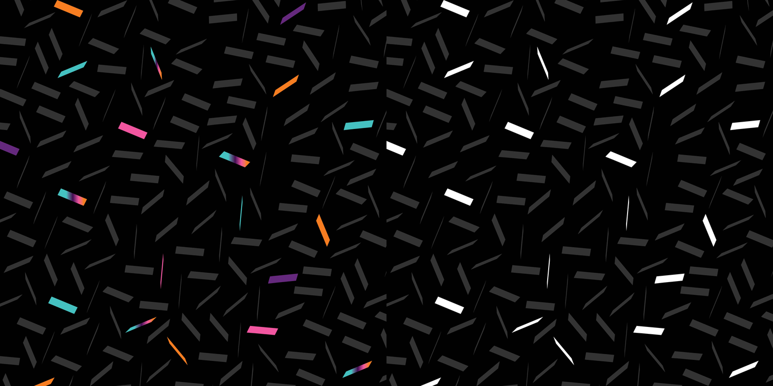
The logos and pattern I created echo the electricity of the city through the building, street corner and street signage shapes combined with neon greens and blue accent colors. A flickering cityscape shows the passage of time through a late night of work in Manhattan. It quietly tells the viewer that MannicMedia is up and working alongside the best and most sought-after creative minds in NYC.
Creative Direction, Strategy, Content and Design: Dawn Camner



Brand New: A Collective
Two talented marketing executives started a business focused on content programs that partner music artists with consumer brands. The goal was to create an identity that expresses an expertise on both artists and consumer brands while differentiating themselves as a collective that delivers long-tail programs to endure, grow and become culturally significant. Something that feels new and bold.
We started the process with a brand discovery workshop where we were able to identify what makes the business unique. The discovery revealed a desire to innovate with the ability to create the type of content that brands need in order to drive equity, influence music fans, and be culturally relevant. We created a vibrant identity represented by a colorful gradient and many-spoked wheel logomark that expresses the kinetic energy of an intuitively connected, culture-shifting collective.
Creative Direction, Strategy, and Design: Dawn Camner


